
← Back to explore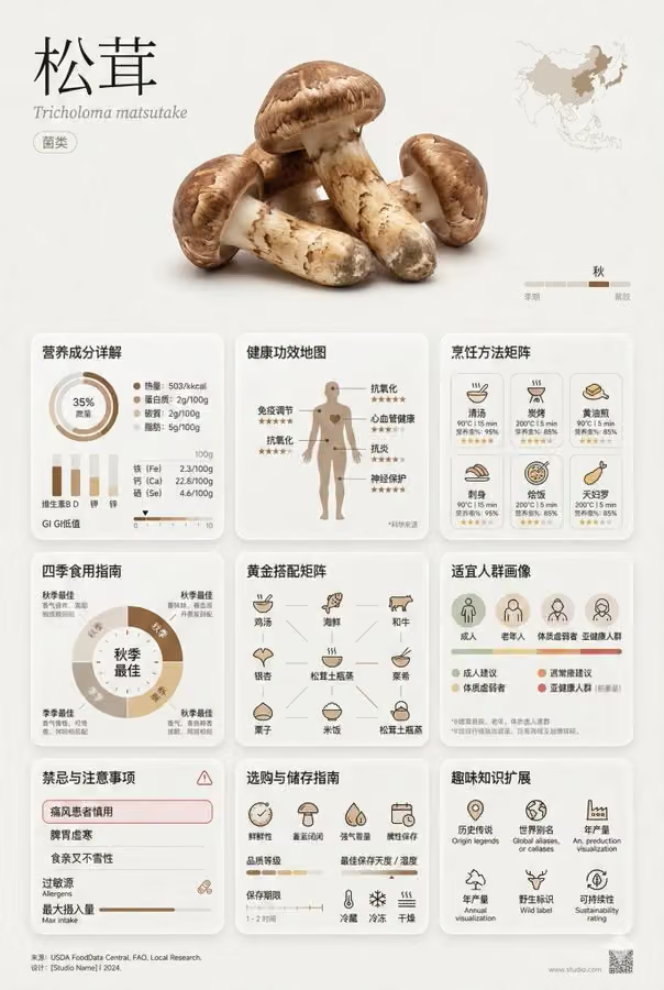
Minimalist Art Style Asparagus Encyclopedia Information Card
Posters & Visuals · Minimal · GPT Image
A minimalist art style [asparagus] encyclopedia information card, museum quality design, rich in information but visually restrained
【Overall Composition - Golden Ratio Layout】
- Aspect Ratio: 2:3 Vertical or 3:4 Square
- Three Visual Areas:
  * Top Display Area (30%): Large-sized ingredient photography + elegant title layout
  * Middle Information Area (60%): Multi-level information module grid system
  * Bottom Annotation Area (10%): Source annotation + design details
【Top Display Area - Visual Focus】
• Ingredient Name: Extra-large font size, thin line/Song type, increased character spacing
• Scientific Name: Small font size italic, gray tone
• Ingredient Classification Tag: Minimalist capsule shape tag
• Main Image: Background-free ingredient close-up, studio lighting, subtle shadow
• Origin Small Map Icon
• Seasonal Timeline Line Chart
【Middle Core Information Area - 9 Modules】
1. Nutritional Composition Details
   - Ring Chart: Calorie, protein, carbohydrate, fat proportion
   - Bar Chart: Vitamin A/C/E/K content comparison
   - List of Trace Elements (calcium, iron, zinc, etc.)
   - Nutritional data per 100g precisely marked
   - GI value (glycemic index) visual ruler
2. Health Benefits Map
   - Human silhouette diagram marking the beneficial parts
   - Iconic display of 5-6 main benefits
   - Benefit intensity level identification (⭐⭐⭐⭐⭐)
   - Small annotations of scientific research sources
3. Cooking Method Matrix
   - Icon grid of 8-10 cooking methods
   - Best temperature/time parameters for each method
   - Nutrient retention rate percentage display
   - Recommendation star rating
   - Difficulty level color identification
4. Seasonal Eating Guide
   - Circular time wheel design
   - Mark the best eating months
   - Description of changes in benefits in different seasons
   - Seasonal matching suggestions
5. Gold Match Matrix
   - 9-grid matching ingredient icons
   - Briefly annotated matching reasons
   - Synergistic/enhancement/contradiction warnings
   - Classic dish recipe examples
   - Nutritional complementary relationship connection diagram
6. Suitable Population Portrait
   - Population icons (children/pregnant women/elderly/athletes, etc.)
   - Recommendation level color coding
   - Special population dose suggestions
   - Age classification guide
7. Contraindications and Precautions
   - Red warning frame design
   - Clear list of unsuitable populations
   - Allergen identification
   - Drug interaction prompts
   - Maximum intake warning line
8. Purchase and Storage Guide
   - Freshness judgment points (color/touch/smell)
   - Quality grade division illustration
   - Best storage temperature/humidity data
   - Shelf life timeline
   - Refrigerator/freeze/room temperature icon guide
9. Fun Knowledge Expansion
   - Historical stories (origin/myth)
   - Aliases in various parts of the world
   - Annual output data visualization
   - Organic/Genetically modified identification explanation
   - Sustainability rating
【Visual System - Minimalist Art Aesthetics】
Color Scheme:
- Main Color: Natural color extraction from the ingredient itself
- Auxiliary Color: Earth color system (rice white/avocado/linen/graphite gray)
- Emphasis Color: Restrained use of 1-2 high purity colors
- Background: Pure white or very light gray (#FAFAFA)
- Text: Dark gray instead of black (#2C2C2C)
Font System:
- Title: Extra-thin line sans-serif font (Helvetica Neue UltraLight)
- Text: Modern geometric font (DIN/Futura)
- Data: Monospaced font (Roboto Mono)
- Chinese: Source Han Sans Light/Fangzheng Lantinghei
- Font Size Hierarchy: 6-level font size system (48/32/24/16/12/10pt)
Icon System:
- Uniform 2pt line width
- Round corner consistency (2px)
- 24x24px grid alignment
- stroke instead of fill priority
- Negative space utilization
Layout System:
- 12-column grid system
- 8pt grid alignment
- Module spacing: 24pt/32pt/48pt
- Margin: Page margin starts at 48pt
- Card rounded corner: 8-12px
- Subtle dividing line: 0.5pt, 15% transparency
Texture Details:
- Micro gradient background (3-5% color value change)
- Soft shadow (0 4px 24px rgba(0,0,0,0.04))
- Sandblasted glass effect (backdrop-filter: blur(20px))
- Subtle height differences between elements (elevation system)
- Light color filling in data area (5% transparency)
【Information Visualization Principles】
- Data Chart: Edward Tufte's minimalist data ink principle
- Remove unnecessary decorations
- Chart grid lines extremely faint (10% transparency)
- Data points precisely labeled
- Trend lines smooth and natural
【Breathing Creation】
- Module spacing ≥ 25% of module content width
- Line spacing 1.6-1.8 times text height
- Paragraph spacing ≥ 2 line heights
- White space law for combination of text and images
Style Keywords:
Swiss Internationalism Graphic Design, Japanese Wabi-Sabi Aesthetics, Bauhaus Functionalism,
Scandinavian Minimalism, Dieter Rams Design Philosophy,
Muji Visual Language, Kinfolk Magazine Aesthetics,
Apple Product Design Language, Google Material Design Essence