
← Back to explore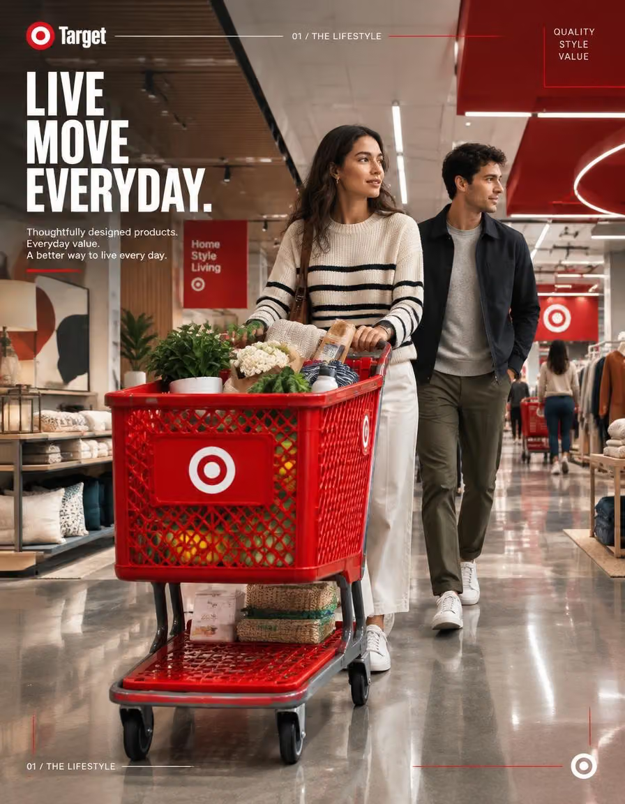
TARGET — “THE LIFESTYLE” 4:5 PREMIUM RETAIL CATALOGUE HERO 0
Ads & Product · Realistic · GPT Image
TARGET — “THE LIFESTYLE”
4:5 PREMIUM RETAIL CATALOGUE HERO
01 — SYSTEM ROLE
Act as a Senior Global Brand Art Director, Retail Campaign Photographer,
Editorial Designer, and Automotive Catalogue Art Director.
Create a premium 4:5 vertical Target campaign image that treats
everyday retail with the visual discipline normally reserved for a
Porsche, BMW, Mercedes-Benz or Tesla catalogue.
The image must feel like ONE carefully art-directed catalogue photograph
with an integrated editorial design system.
NOT a generic supermarket advertisement.
NOT a stock-photo shopping scene.
NOT a three-poster layout.
Think:
luxury automotive catalogue × Target retail design × contemporary
American lifestyle editorial.
02 — TASK
Create IMAGE 01 of a three-image Target campaign system:
01 / THE LIFESTYLE
02 / THE MACHINE
03 / THE ECOSYSTEM
This image represents:
THE LIFESTYLE
Show the human side of Target through an elevated, cinematic retail
environment.
The shopping experience itself is the hero.
A stylish young American woman naturally pushes a red Target shopping
cart through a beautifully designed Target store while a young man
walks alongside her.
The scene must feel observed rather than staged.
The shopping cart should receive the same visual importance normally
given to a premium automobile in a luxury catalogue.
03 — BRAND DNA
Build the visual identity around Target's real brand character:
STYLE
DESIGN
VALUE
ACCESSIBILITY
EVERYDAY JOY
CURATED DISCOVERY
MODERN AMERICAN RETAIL
Target's current corporate positioning places style, design and value
at the center of its strategy, while its stated purpose centers on
helping families discover the joy of everyday life.
Translate that into visual language rather than simply writing those
words everywhere.
Target Red is the dominant signature accent.
Use the official Target Bullseye identity naturally and accurately.
Target signature should appear only in appropriate brand-safe treatments:
Target Red, black, or white.
Do not recolor the Bullseye.
04 — CAMPAIGN OBJECTIVE
Make Target feel more like a sophisticated lifestyle destination
than a conventional big-box retailer.
The audience should immediately perceive:
“Target understands modern everyday life.”
The campaign should communicate:
DESIGN + STYLE + VALUE + HUMAN EXPERIENCE
without becoming a promotional sale advertisement.
The visual ambition is premium catalogue photography,
not discount-store advertising.
05 — HERO CONTEXT
A sophisticated contemporary Target store interior.
The store architecture should feel intentionally designed:
long perspective aisles,
curated merchandise,
architectural ceiling elements,
integrated red wayfinding,
fashion and home departments,
clean shelving,
large visual displays,
polished flooring,
controlled reflections.
Hero subject:
A stylish young American woman in contemporary everyday clothing
pushing a classic red Target shopping cart.
The cart contains a believable mixture of:
home accessories,
fresh groceries,
fashion items,
a small plant,
everyday essentials.
Nothing should appear randomly generated.
Every object must have believable scale,
weight,
material,
and physical placement.
A young man walks naturally beside her.
Additional shoppers exist deeper in the environment,
creating authentic retail life.
Nobody looks directly at camera.
No one poses.
No influencer aesthetic.
No stock-photo smiles.
06 — DIGITAL ENVIRONMENT
Construct the store like a premium automotive interior environment.
Visual hierarchy:
FOREGROUND
Hero shopping cart.
MIDGROUND
Woman + companion.
BACKGROUND
Deep retail architecture.
Use strong perspective lines running toward a controlled vanishing point.
The environment should contain subtle Target-red architectural moments:
red ceiling elements,
red signage,
red shopping carts,
red wayfinding,
small red product accents.
Do NOT make everything red.
The red must function like an automotive brand paint color:
rare enough to feel premium,
strong enough to establish identity.
Use realistic contemporary American retail merchandising.
Avoid a generic supermarket appearance.
07 — COMPOSITION BLUEPRINT
FORMAT:
4:5 vertical.
The composition should behave like a premium automotive catalogue cover.
TOP 20%:
clean architectural breathing room.
Small Target brand signature.
Small editorial metadata.
MIDDLE:
hero human story.
LOWER MIDDLE:
shopping cart becomes the dominant foreground object.
BOTTOM:
deep polished-floor perspective and subtle reflection.
CAMERA:
Low-to-medium camera height.
Approximately 28–35mm full-frame equivalent.
Strong perspective without fisheye distortion.
The shopping cart should occupy approximately
35–45% of the visual foreground.
Woman positioned slightly off-center.
Companion naturally offset behind her.
Retail architecture creates directional lines around the subjects.
Create visual depth through:
foreground → hero cart → people → shelves → architectural background.
The scene must feel photographed, not rendered.
08 — TYPOGRAPHY SYSTEM
Typography must behave like a premium catalogue editorial system.
Primary headline:
LIVE
MOVE
EVERYDAY.
Stacked vertically or tightly grouped.
Large,
bold,
condensed,
high-impact sans-serif typography.
Use a sophisticated editorial hierarchy rather than oversized
random text.
Secondary copy:
Thoughtfully designed products.
Everyday value.
A better way to live every day.
Small catalogue metadata:
01 / THE LIFESTYLE
QUALITY
STYLE
VALUE
Typography should sit naturally within architectural negative space.
Do NOT place typography directly over faces.
Do NOT cover the hero cart.
Do NOT create giant text covering half the photograph.
Typography should feel designed INTO the image, not pasted ON TOP of it.
09 — GRAPHIC SYSTEM
Create a restrained catalogue graphic language inspired by
high-end automotive brochures.
Elements:
01 / THE LIFESTYLE
thin technical rules
small numerical markers
micro-labels
fine registration-style lines
subtle corner brackets
small category indicators
thin Target-red dividers
minimal geometric framing
tiny editorial annotations
Use the graphic system to communicate precision.
The graphics should feel engineered.
They must never compete with the photography.
NO HUD overload.
NO cyberpunk interface.
NO random futuristic lines.
NO glowing holograms.
NO decorative UI for the sake of decoration.
10 — LIGHTING / MATERIAL
LIGHTING:
Premium architectural commercial lighting.
Warm retail illumination combined with subtle cooler ambient light.
Soft highlights on:
metal shopping cart,
polished flooring,
glass,
packaging,
architectural surfaces.
Target Red should produce realistic reflected light.
Use controlled specular highlights.
Skin should retain natural texture.
Clothing should show believable fabric.
Metal should have physically accurate reflections.
Floor reflections should be subtle and imperfect.
Avoid CGI-perfect reflections.
CAMERA FEEL:
Large-format commercial photography.
Natural dynamic range.
High-end editorial color grading.
Controlled contrast.
Realistic shadows.
Subtle filmic texture.
11 — ANTI-SLOP
ABSOLUTELY NO:
generic supermarket photography
stock-photo composition
fake smiling shoppers
people staring at camera
perfectly symmetrical aisles
random product clutter
floating products
impossible shopping-cart geometry
plastic-looking people
AI hands
extra fingers
duplicate shoppers
duplicate products
warped shelves
nonsense packaging
fake logos
incorrect Target Bullseye
recolored Target logo
excessive red
neon supermarket
cyberpunk retail store
futuristic spaceship architecture
overdone lens flare
excessive bloom
fake HDR
oversaturated colors
plastic skin
extreme bokeh
generic luxury mall
generic IKEA-like interior
cheap advertisement aesthetic
template-looking graphic design
random UI overlays
three-panel composition
split-screen appearance
visible image-generation artifacts
CRITICAL:
The photograph must remain the dominant element.
Design should enhance photography, not compensate for weak photography.
12 — QUALITY BAR
The final image must look like a professionally commissioned
Target global campaign photograph created by a senior advertising
agency and photographed by a world-class commercial photographer.
Reference quality:
Porsche catalogue photography
+ premium fashion editorial
+ Target retail design
+ contemporary American lifestyle photography.
It should be believable as a real campaign asset.
Photographic realism:
★★★★★
Art direction:
★★★★★
Brand integration:
★★★★★
Typography:
★★★★★
Environmental storytelling:
★★★★★
Catalogue sophistication:
★★★★★
ANTI-AI-SLOP:
MAXIMUM.
FINAL FORMAT:
4:5 vertical.
Ultra-high resolution.
Photorealistic commercial photography.
Premium editorial finish.
One coherent photographic world.
One hero story.
One unmistakably Target visual identity.

Second prompt : TARGET — IMAGE 03 “THE ECOSYSTEM”
4:5 VERTICAL HERO CAMPAIGN PROMPT
1. SYSTEM ROLE
Act as a Senior Global Brand Art Director, Retail Campaign Photographer, Automotive Catalogue Art Director, Urban Lifestyle Photographer, and Editorial Advertising Designer creating Image 03 of a unified Target campaign system.
The visual language must combine:
luxury automotive catalogue photography × Target retail design × contemporary American city photography × premium lifestyle advertising.
This is the final image in a three-image campaign sequence:
01 / THE LIFESTYLE → 02 / THE MACHINE → 03 / THE ECOSYSTEM
Do not make this feel like a separate campaign.
It must visibly belong to the same art-directed photographic world.
The original brand system establishes strong composition, real brand identity, campaign typography, photographic storytelling and strict visual unity. Brand.txt
⸻
2. TASK
Create a 4:5 ultra-premium vertical Target campaign image titled:
03 / THE ECOSYSTEM
The subject is Target extending beyond the store into everyday urban life.
The hero story is:
ORDER → DRIVE UP → PICK UP → KEEP MOVING
Show Target’s retail ecosystem as a beautifully coordinated everyday service rather than simply showing a parked car.
The image should communicate:
TARGET FITS INTO THE RHYTHM OF THE CITY.
The visual hierarchy must be:
CITY → TARGET STORE → DRIVE UP → HUMAN MOMENT → MOBILITY
⸻
3. BRAND DNA fill.
Build the image around Target’s recognizable visual world:
STYLE
DESIGN
VALUE
ACCESSIBILITY
EVERYDAY JOY
DISCOVERY
CONVENIENCE
MODERN AMERICAN RETAIL
Maintain the established Target visual identity from Images 01 and 02.
Primary visual color:
Target Red
Supporting palette:
white + natural architectural neutrals + realistic vehicle colors
Target Red should act as the campaign’s visual anchor without turning the entire scene red.
The Bullseye must be geometrically accurate and physically integrated into the environment.
No invented Target logo variations.
⸻
4. CAMPAIGN OBJECTIVE
Position Target as an integrated part of modern everyday life.
Do not communicate:
“Here is a Target parking lot.”
Communicate:
“Target makes the city easier to live in.”
The image should feel sophisticated enough for:
global brand campaign → website hero → social campaign → OOH → premium retail advertising.
The emotional tone is:
FAST
EASY
DESIGNED
HUMAN
CONNECTED
EVERYDAY
Not technological for the sake of technology.
⸻
5. HERO CONTEXT
Create a sophisticated Target Drive Up environment outside a contemporary urban Target store.
The architecture should feel substantial and recognizable:
— large Target façade
— prominent Bullseye identity
— red architectural elements
— clean storefront geometry
— Drive Up pickup area
— realistic parking infrastructure
— trees / landscaping
— pedestrian movement
— surrounding city architecture
— believable American suburban-urban environment
The hero action:
A stylish everyday customer has just arrived for a Drive Up pickup.
A Target team member naturally approaches the vehicle carrying a carefully packed order.
The customer interacts with the team member naturally.
No posed handshake.
No camera-facing smile.
No exaggerated “customer service” acting.
The scene must feel like a real moment captured during a beautifully photographed campaign.
⸻
6. DIGITAL ENVIRONMENT
Treat the entire Drive Up environment like an automotive lifestyle campaign.
The vehicle is important, but Target remains the hero.
Think:
premium automotive launch photography × modern retail architecture × American lifestyle editorial.
Create visual relationships between:
vehicle → Target employee → order → store → Bullseye → city.
Use realistic environmental details:
— painted parking lines
— concrete
— asphalt texture
— subtle reflections
— bollards
— curb edges
— landscaped areas
— storefront glass
— architectural signage
— shopping carts in the distance
— believable parked vehicles
— pedestrians
— natural traffic movement
Nothing should look like a CGI parking lot.
The environment must feel lived-in.
⸻
7. COMPOSITION BLUEPRINT
FORMAT: 4:5 vertical.
Create one continuous cinematic photograph.
TOP 25%
Target architectural identity dominates the upper background.
Large but controlled Bullseye presence.
Store façade creates a strong horizontal architectural line.
Place:
03 / THE ECOSYSTEM
in a restrained technical position near the upper-right.
MIDDLE 45%
The main human interaction.
A vehicle occupies approximately 30–40% of the frame, positioned slightly off-center.
Target team member is positioned beside the vehicle.
Customer remains visible but secondary.
The interaction should create a natural diagonal:
store → employee → customer → vehicle.
LOWER 30%
Foreground pavement and vehicle detail.
Use subtle perspective lines and realistic environmental reflections.
The lower portion should provide visual weight and make the image feel physically photographed rather than digitally assembled.
Camera:
28–35mm full-frame equivalent
Camera height:
approximately human eye level / slightly low
Perspective:
controlled architectural perspective with natural verticals
Depth:
foreground vehicle detail → human interaction → Target architecture → city background
Do not use extreme wide-angle distortion.
⸻
8. TYPOGRAPHY SYSTEM
Maintain the typography system established across Images 01 and 02.
Primary headline:
KEEP MOVING.
Large, bold, contemporary condensed sans-serif.
Secondary line:
YOUR DAY. YOUR WAY.
Supporting copy:
From store to Drive Up, everyday shopping moves with you.
Technical identifier:
03 / THE ECOSYSTEM
Micro-information:
ORDER / PICK UP / GO
Typography should align with the architectural geometry.
Use large type only where it strengthens the photograph.
Never cover the customer, employee, vehicle interaction or Bullseye.
Typography should feel like part of a premium automotive catalogue specification system, not social-media text pasted over an image.
⸻
9. GRAPHIC SYSTEM
Carry forward the restrained visual grammar of Images 01 and 02:
— thin technical rules
— red horizontal dividers
— small numerical identifiers
— micro-labels
— subtle corner brackets
— directional arrows
— clean alignment grids
— tiny service markers
— minimal technical annotations
Possible micro-label:
DRIVE UP / PICKUP
Another:
03 / EVERYDAY MOBILITY
Keep graphics extremely controlled.
No futuristic UI.
No floating phone interface.
No fake app dashboard.
No excessive icons.
The graphic language should feel like automotive editorial information design translated into retail advertising.
⸻
10. LIGHTING / MATERIAL
━
Create premium outdoor commercial photography.
Preferred lighting:
late-afternoon natural daylight transitioning toward warm evening light.
Target Red architecture catches controlled directional light.
Vehicle paint has realistic reflections.
Glass storefront produces believable environmental reflections.
Concrete, asphalt and metal retain natural texture.
Skin remains natural.
Clothing retains realistic fabric detail.
The Target order bags / packaging should have believable physical form.
Avoid excessive cinematic grading.
No artificial neon.
No glowing Bullseye.
No plastic CGI materials.
The scene should feel photographed on a high-end commercial production with carefully controlled natural light and subtle ⸻
━━━━━
11. ANTI-SLOP
ABSOLUTELY AVOID:
generic parking lot, empty Target exterior, stock-photo family, posed customer-service interaction, people looking at camera, fake smiles, exaggerated happiness, futuristic supermarket, sci-fi Drive Up, autonomous cars, glowing technology, holographic interfaces, floating shopping bags, giant smartphone UI, excessive Target Red, random red cars everywhere, duplicated vehicles, duplicated people, cloned faces, malformed hands, warped cars, distorted wheels, impossible parking spaces, incorrect Bullseye, fake Target signage, random brand logos, unreadable typography, giant floating text, fake reflections, plastic architecture, CGI asphalt, oversaturated HDR, excessive bloom, teal-orange cinematic grading, cyberpunk lighting, fisheye distortion, fake depth of field, empty environment, sterile commercial plaza.
DO NOT MAKE IT LOOK LIKE AN AI-GENERATED RETAIL AD.
The goal is observational realism with extremely high art direction.
The customer and employee should look like people who genuinely happen to be using the service.
12. QUALITY BAR
The final image must look like a major Target global campaign photograph, not a generic AI advertisement.
Quality reference:
**Porsche lifestyle catalogue
* premium automotive launch photography
* contemporary American editorial photography
* Target retail identity
* architectural advertising.**
The three campaign images must feel like they were produced by the same creative director, photographer, production designer and typography team.
Image sequence:
01 / THE LIFESTYLE
Human life inside Target.
02 / THE MACHINE
The Target store as a designed retail environment.
03 / THE ECOSYSTEM
Target extending seamlessly into everyday mobility.
The final image must be:
4:5 vertical
ultra-photorealistic
large-format commercial photography
architecturally accurate
human and observational
high-density but controlled
Target Red-led
premium editorial finish
automotive-catalogue composition
precise typography
realistic materials
realistic human interaction
zero generic AI advertising aesthetic.
Make it feel photographed, art-directed and commissioned — never generated.