
← Back to explore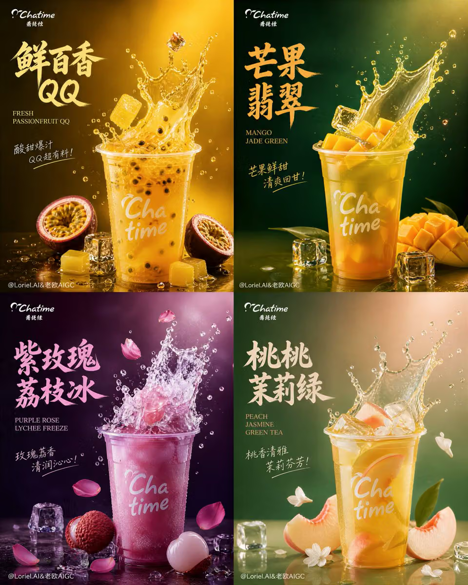
Create an ultra-premium commercial poster for Chatime in a s
Ads & Product · Filmic · GPT Image
Create an ultra-premium commercial poster for Chatime in a strict 2x2 four-panel layout, designed as a world-class global tea beverage campaign. Each panel must present one flavor as a self-contained premium visual world, built around one dominant hero drink positioned centrally or slightly lower center, with a sculptural upward liquid splash and only a few highly intentional supporting ingredients. The overall artwork must feel bold, youthful, premium, hyper-real, and highly collectible, while also becoming more spacious, more controlled, and more elevated than a typical beverage ad. The background in every panel must be pulled further open, with more negative space, cleaner gradients, subtler atmosphere, and fewer visual distractions. The product must remain the absolute protagonist in every quadrant. Use refined cinematic commercial lighting, ultra-clean fluid simulation, premium print-like grain, crisp glassy ice, obsessive fruit detail, restrained micro-particles, and elegant typography hierarchy. Add minimal official-feeling Chatime logo placement, bold artistic Chinese flavor title, smaller English subtitle, and restrained handwritten accent text in each panel.

Core layout:
Use a strict 2x2 four-panel composition with equal visual weight, clean spacing, and consistent editorial logic. Each panel must feel like a complete flagship key visual for one Chatime flavor, but the entire board must remain unified by shared layout discipline, premium lighting, and brand polish. The cup in each panel should be large, highly readable, and clearly dominant. The liquid splash must rise upward in a dynamic but controlled way, while fruit, ice, and garnish elements appear in fewer quantities and more precise placements. No overcrowding, no filler, no chaotic scattering.

Milk Cloud Orbit + Cream Halo Transit direction:
Push the strongest established qualities further: stronger hero-cup dominance, cleaner and more luxurious splash design, more spacious premium backgrounds, and more restraint in ingredient distribution. Keep the same four-flavor four-panel skeleton, but refine the composition so every supporting element earns its place. Replace broad decorative clutter with a smaller number of highly strategic ingredient accents. Let the liquid itself become more sculptural and important, while fruit and ice act as elegant punctuation rather than dense decoration. The result should feel calmer, richer, more brand-expensive, and closer to an international design annual cover series.

Flavor 1, Fresh Passionfruit QQ:
Create a vivid passionfruit-yellow flavor world with deep amber undertones. Show one hero Chatime cup filled with Fresh Passionfruit QQ, placed prominently in the lower middle area. A clean, translucent golden-yellow tea splash should erupt upward with juicy energy and refined structure. Surround the cup with only a few precisely placed supporting elements: one or two halved passionfruits, a small amount of glossy passionfruit pulp and seeds, several restrained semi-translucent QQ jelly pieces, and a few crystal-clear ice cubes. The flavor identity must feel bright, fresh, tropical, and elastic, but the composition must remain premium and uncluttered. Use a deep yellow-gold to dark amber minimal gradient background with generous negative space.

Flavor 2, Mango Jade Green:
Create a rich mango-gold and jade-green flavor world. Show one hero Chatime cup filled with Mango Jade Green tea, with a smoother, denser, more silky upward splash than the passionfruit panel. Use only a few carefully selected ingredient accents: several elegant mango cubes or slices, subtle green-tea tonal cues, a small number of sharp realistic ice cubes, and fine droplets. The liquid must feel premium, fruit-rich, and translucent with tea clarity. Avoid crowding the frame. Use a deep mango-gold to emerald-dark minimal background with more open breathing room around the cup and splash.

Flavor 3, Purple Rose Lychee Freeze:
Create a premium rose-violet and plum-black flavor world. Show one hero Chatime cup filled with Purple Rose Lychee Freeze, with a semi-frozen slushy upward burst that feels lighter, colder, and more crystalline than the other panels. Surround it with only a few key accents: one or two peeled lychee fruits, several restrained translucent frozen fragments, a few elegant rose petals, and minimal icy droplets. The visual identity must feel fragrant, cool, and luxurious, with a floral-fruit sophistication. Use a deep purple-plum minimal background with large open dark space and subtle atmospheric depth.

Flavor 4, Peach Jasmine Green Tea:
Create a soft peach-blush and jasmine-green flavor world. Show one hero Chatime cup filled with Peach Jasmine Green Tea, with a graceful upward splash that feels lighter, more fragrant, and more fluidly elegant than explosive. Support it with only a few highly curated accents: delicate peach slices, a minimal hint of jasmine blossoms or petals, a small number of crystal ice cubes, and restrained droplets. The flavor identity should feel airy, refined, and refreshing. Use a peach-blush to muted green-dark minimal background with generous negative space and soft tonal transitions.

Product realism:
All Chatime cups must be rendered with extreme realism and premium commercial fidelity. The cups should feel like official branded beverage cups with authentic sealing-film or lid logic, realistic condensation, subtle reflections, believable plastic texture, premium print sharpness, and correct scale. The branding must remain minimal and official-feeling, never oversized or cheap. The product should always dominate over the splash and supporting ingredients.

Liquid and ice realism:
The tea liquids must be rendered with world-class physical fluid realism: clean splash arcs, realistic viscosity, transparent edges, subtle thickness variation, suspended droplets, crisp refraction, and believable motion frozen at peak impact. Ice cubes must feel glassy, cold, and sharp, with realistic internal fractures and slight condensation. All fluid effects must feel premium, clean, and dynamic, never muddy, never messy, never cartoonish.

Ingredient realism:
Render every fruit and garnish with obsessive detail, but use them sparingly. Passionfruit pulp should feel wet and seed-rich, mango should feel fleshy and dense, lychee should feel translucent and juicy, peach should feel soft and fragrant. QQ jelly must feel semi-translucent and elastic. Rose petals and jasmine accents must remain restrained and elegant, never decorative filler. Ingredient distribution must be more precise, more curated, and more luxurious.

Background and atmosphere:
Make the background in every panel more open, more minimal, and more premium. Use deep flavor-specific gradients with subtle haze, faint depth, and very restrained micro-particles, but remove all unnecessary environmental clutter. The empty space must feel intentional and elevated, like silence in a luxury poster. Each panel should breathe more, allowing the cup and splash to feel more iconic and sculptural.

Print grain aesthetic:
Apply a refined premium print-grain treatment across the artwork. The grain should feel higher-end, tighter, and more intentional, like a luxury printed campaign board rather than rough noise. It should subtly enrich gradients, dark backgrounds, and soft transitions without degrading sharpness. The final effect should feel expensive, editorial, and collector-grade.

Lighting:
Use extremely delicate, soft, premium commercial lighting with cinematic polish. Each panel should have a slightly tailored highlight mood based on the flavor color system, but all four should share the same high-end lighting discipline: velvety highlights on liquid surfaces, crisp edges on ice, appetizing fruit sheen, and elegant shadow depth. The lighting must feel luxurious and controlled, never harsh, never flat.

Typography and graphic design:
Follow the logic of a bold global beverage campaign. Use oversized artistic Chinese flavor titles in each panel, a smaller refined English subtitle beneath or beside them, minimal handwritten accent text, and discreet official-feeling Chatime logo placement. Typography must feel modern, bold, elegant, and spatially integrated, never cheap, never bulky, never generic. Let the emptier background space support the text gracefully.

Color system:
Keep each panel in a clearly distinct signature color world:
1. passionfruit yellow-gold,
2. mango gold with jade-green undertone,
3. rose-violet plum,
4. peach blush with jasmine green undertone.
The color worlds must be rich and recognizable but not overfilled. Let the emptier backgrounds create contrast and sophistication.

Mood:
fresh, bold, youthful, premium, juicy, elegant, sculptural, energetic, flavorful, collectible, modern, high-end, restrained, brand-expensive

Rendering style:
ultra-premium Chatime beverage campaign, strict 2x2 four-panel flavor poster, dominant hero drink, sculptural upward liquid splash, fewer and more precise fruit and ice accents, more open luxury background atmosphere, high-end print grain, hyper-real tea fluid simulation, elegant typography, official logo placement, soft cinematic commercial lighting, world-class beverage advertising aesthetic, 8k, collector-grade image quality

Negative prompt:
cheap milk tea poster, cluttered composition, weak product focus, messy splash, muddy liquid, too many floating ingredients, noisy background, fake ice, generic cup, oversized logo, ugly typography, cartoon drink, random decorative filler, low-resolution details, chaotic ingredient placement, amateur fast-food advertising style, heavy dirty grain